Color Theory in Photography: Wheels, Harmonies & Mood Explained
- May 21, 2024
- 7 min read
Updated: Mar 31
Color theory is one of those concepts that separates snapshots from intentional photographs. It's not just about knowing which colors "look nice together", it's about understanding why they work, what emotions they trigger, and how to use them deliberately to make your images more powerful.
This guide covers the color wheel, the major harmony types photographers actually use, how color affects mood, and how to start applying these principles in your own shooting and editing.

Photo by doctor-a on FreeImages.com
Color Theory in Photography:
What is Color Theory in Photography?
Color theory is a concept in the visual arts that focuses on how colors interact with one another and how we perceive them. Grounded in the science of light and color, it represents a foundational concept with which all photographers should be familiar.
Color theory is important because it helps us understand how colors influence emotions, set the mood, and enhance the aesthetic appeal of visual compositions. It guides the effective use of colors to communicate messages and achieve balance and harmony in art, design, and photography.
At its core, color theory helps you:
Set the mood of an image before anyone consciously processes it
Guide the viewer's eye through a frame
Create visual harmony or intentional tension between elements
Communicate emotion without words
The Color Wheel: How Colors Are Organized
The color wheel is a circular diagram that illustrates the relationships between colors. Conceived by Sir Isaac Newton in the late 17th century, it organizes colors to show how they blend together, providing a visual representation of primary, secondary, and tertiary hues.

Primary, Secondary, and Tertiary Colors
Primary colors
Yellow, red, and blue, the three foundational hues. Every other color derives from combinations of these.

Secondary colors
Obtained by combining adjacent primary colors, these include green, orange, and purple. Green is created by combining yellow and blue, orange is created by combining yellow and red, and purple is created by combining red and blue.

Tertiary colors
Mix a primary with its adjacent secondary and you get a tertiary, colors like blue-green, red-orange, or yellow-green. These in-between hues give you more nuance and are especially useful in color grading.

Color Harmonies: The Schemes That Actually Matter
This is where theory becomes practical. Color harmonies are specific relationships between colors on the wheel, and each one produces a different visual and emotional effect.
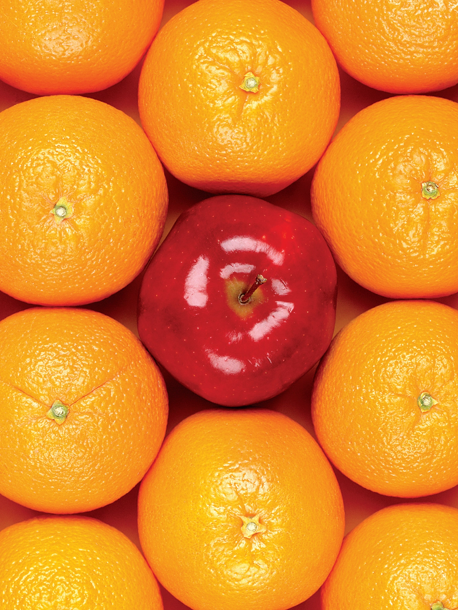
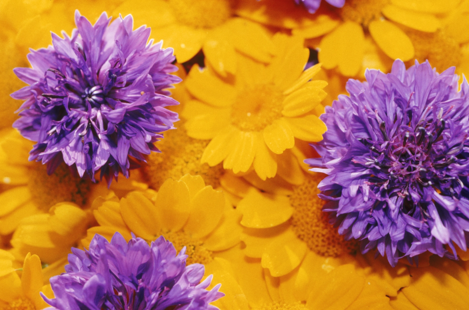
Complementary Colors


Two colors directly opposite each other on the wheel (e.g., orange and blue, red and green). This pairing creates maximum contrast and visual tension. Think of the classic golden-hour portrait with warm skin tones against a cool blue sky. Complementary schemes are eye-catching but need balance; too much of both colors can feel chaotic.
Best for: Portraits, product shots, anything you want to feel bold and vibrant.

Photo by dinny on FreeImages.com
Split-Complementary
A variation of complementary: instead of the direct opposite, you use the two colors adjacent to it. Slightly softer than full complementary, still high-contrast. Easier to work with for beginners.
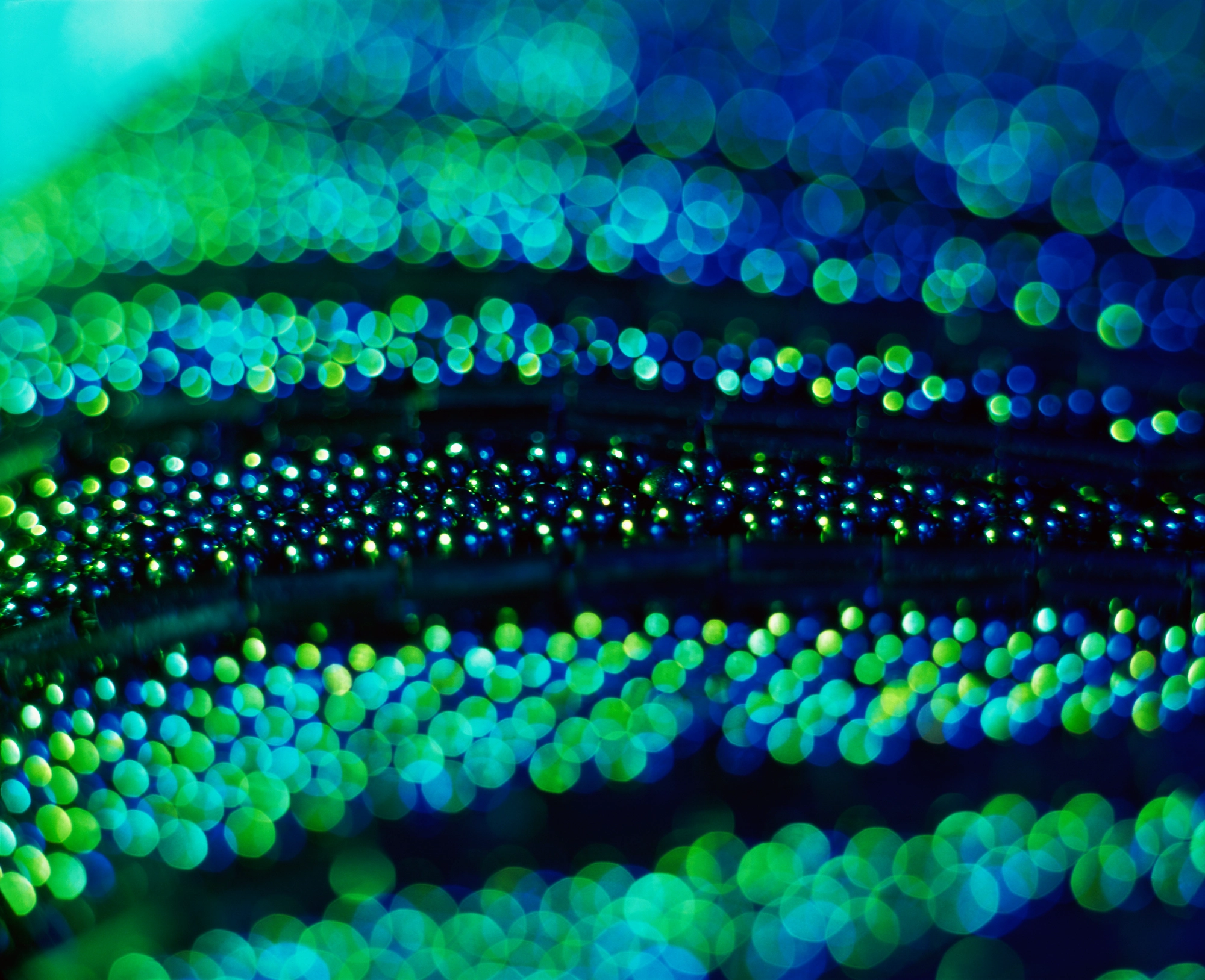
Analogous Colors
Colors sitting next to each other on the wheel (e.g., green, blue-green, blue). They share undertones, so they naturally harmonize, the result feels calm, cohesive, and restful. Nature photography often works this way without any deliberate effort (think forest greens and teal shadows).
Best for: Landscape, nature, serene lifestyle imagery.

Photo by pkavith1 on FreeImages.com
Triadic Colors

Three colors evenly spaced around the wheel (e.g., red, yellow, blue, or purple, green, orange). This creates vibrant contrast with more balance than complementary, the tension is distributed across three points. It's a harder scheme to pull off in photography, but street photography and editorial work often use it effectively.
Best for: Editorial, fashion, street photography where controlled chaos works.

Photo by weblux on FreeImages.com
How Color Harmonies Affect the Mood of a Photo
Color harmonies do more than make an image look balanced. They also shape how a photograph feels.
Different combinations create different emotional tones:
Complementary colors tend to feel bold, energetic, and attention-grabbing because of their strong contrast.
Analogous colors usually create a softer, calmer, and more natural look, since the colors blend more gently into one another.
Triadic color schemes often feel vivid and playful while still maintaining visual balance.
This is one of the reasons color theory matters so much in photography. It helps you move beyond simply capturing a scene and start making decisions about mood, emphasis, and atmosphere.
For example, a blue-and-orange image often feels dynamic and cinematic, while a palette built around greens and blue-greens can feel quiet, fresh, or meditative.
Color Harmony | How It Works | Visual Effect | Common Use in Photography |
Complementary | Colors opposite on the color wheel | High contrast, bold, dynamic | Street, travel, portraits, fashion |
Analogous | Colors next to each other on the color wheel | Soft, cohesive, calm | Nature, landscape, lifestyle |
Triadic | Three evenly spaced colors | Vibrant, balanced, playful | Editorial, creative portraits, design-led compositions |
👉 If you want to go deeper into the emotional and symbolic meaning of individual colors, read our article on color psychology in photography.
Understanding Hue, Tint, Shade and Tone
For those beginning to explore the world of color theory, it's important to grasp the basics of hue, tint, tone, and shade. These elements are fundamental for understanding how colors are created and manipulated.

A hue is the name we give to pure colors, those we see on the color wheel. Examples include red, blue, and yellow. Hues are the basic building blocks of color theory, representing the full spectrum of visible light.
A tint is created by adding white to any hue. This process lightens the hue but does not change its original color. Tints are lighter versions of the original hue, often softer and pastel-like.
A tone is obtained by adding neutral gray (black + white) to a hue, which often results in a more muted version of the original color.
A shade is created by adding black to a hue, making the original color darker. Shades can add depth to colors and are often used to create a more dramatic or somber mood.
Adjustment | What It Does |
Hue | The pure color: red, blue, green |
Tint | Hue + white → softer, pastel, airy |
Shade | Hue + black → darker, deeper, moody |
Tone | Hue + gray → muted, vintage, subdued |
Quick Reference: Color Theory Simplified
Concept | Definition | Examples |
Primary Colors | Fundamental colors from which all other hues are derived. | Yellow, red, blue |
Secondary Colors | Colors formed by combining two primary colors. | Green (yellow + blue) |
Tertiary Colors | Colors created by mixing primary colors with adjacent secondary colors. | Blue-green |
Complementary Colors | Colors opposite each other on the color wheel, offering high contrast and vibrancy. | Orange and blue |
Analogous Colors | Colors adjacent to each other on the color wheel, providing harmony and a serene effect. | Green, blue-green, blue |
Triadic Colors | Three colors equidistant from each other on the color wheel, providing contrast and balance. | Purple, green, orange |
Tint | Hue + white | Pastel pink |
Shade | Hue + black | Deep burgundy |
Tone | Hue + gray | Muted sage |
Color Theory in Shooting vs. Editing
You can apply color theory at two stages:
In the field
Seek out scenes where complementary colors naturally appear (a red door in a teal wall, orange fall foliage against blue sky)
Use analogous color palettes as a compositional anchor, landscapes and natural scenes give you this for free
Look for color-dominant backgrounds that create separation from your subject
In post-processing
Color theory is just as useful in editing as it is in-camera.
In Lightroom, Photoshop, Affinity, and Capture One, photographers often apply color theory through white balance, HSL tools, split toning, color grading wheels, and selective adjustments. These tools make it possible to reinforce or reshape the color relationships already present in a photo.
For example:
A photographer might enhance a complementary palette by cooling shadows and warming highlights.
An analogous palette can be strengthened by gently shifting nearby hues closer together for a more unified look.
A triadic look can be balanced by reducing saturation in one of the three dominant colors so the frame does not feel overwhelming.
Presets also often rely on color theory, even when they are marketed in a more stylistic way. A cinematic preset may emphasize blue-orange contrast, while a soft editorial preset may lean into analogous pastel tones.
The key is to use these tools intentionally. Instead of applying presets at random, it helps to understand what color relationship they are enhancing and how that affects the final mood of the photo.
Practical Exercises: Training Your Eye for Color
One of the best ways to understand color theory is to practice seeing it in real scenes.
Here are a few simple exercises:
Shoot one color harmony at a time: Choose a complementary, analogous, or triadic scheme before you go out shooting, and try to build at least three photos around that palette.
Limit your palette: Instead of photographing every color in a scene, focus on two or three that work well together. This helps create cleaner compositions.
Analyze color before pressing the shutter: Pause and ask yourself: is the scene driven by contrast, harmony, or color repetition?
Study images you already like: Look at your favorite photos and identify the color relationships they use. Over time, this makes color theory much more intuitive.
These exercises help turn color theory from a design concept into a practical composition tool.

Color theory won't make you a better photographer overnight, but it gives you a vocabulary for decisions you were probably already making intuitively. Once you can name what you're seeing: that's complementary contrast, that's an analogous palette, you can start making those choices on purpose.
👉 If you want to understand how colors are reproduced technically, see our guide to technical color models.