Color Psychology in Photography: What Each Color Means
- May 27, 2024
- 5 min read
Updated: Mar 25
The way in which color subtly evokes feelings, shifts mood, narrates a story without talking or doing anything, and completes an overall vibe is tangible. As a photographer, understanding the psychology of colors can greatly enhance your ability to communicate through your images. This article will break down different colors and explain how perceptions are affected by each color to help you build your photographic skills.

Photo by tburgey on FreeImages.com
The Meaning of Colors in Photography
The Color Red: Passionate and Energetic
Red is a powerful color that grabs attention and evokes strong emotions, such as passion, excitement, and even danger. In photography, red can be used to highlight the most critical elements of your composition, making them stand out vividly.


The Color Blue: Cool and Trustworthy
Blue is known for its calming and serene qualities. It conveys a sense of tranquility and trustworthiness. Using blue in your photos can create a peaceful atmosphere, perfect for landscapes or serene portraits.


The Color Green: Intellectual and Diplomatic
Green symbolizes nature and renewal. It is associated with growth, harmony, and freshness. Incorporating green into your photographs can evoke feelings of balance and rejuvenation, making it ideal for nature and outdoor photography.

The Color Yellow: Optimistic, Cheerful, and Confident
Yellow is the color of sunshine, exuding warmth and happiness. It can evoke feelings of joy and optimism. Use yellow to bring a cheerful and energetic vibe to your photos, but be cautious of overuse as it can become overwhelming.


The Color Purple: Luxury, Nobility, and Creativity
Purple combines the stability of blue and the energy of red, symbolizing luxury, power, and creativity. It adds a sense of sophistication and mystery to your images, making it suitable for artistic and high-end photography.

The Color Orange: Enthusiasm, Warmth, and Vitality
Orange is a dynamic color that combines the energy of red with the cheerfulness of yellow. It represents enthusiasm and warmth. Orange can be used to create vibrant and lively photos, drawing viewers' attention without the intensity of red.

The Color Pink: Love and Nurturing
Pink is often associated with love, compassion, and nurturing. It has a calming effect and conveys a sense of care and affection. Use pink in portraits and romantic scenes to evoke tenderness and warmth.


The Color Black: Elegance and Mystery
Black is a powerful and sophisticated color that evokes elegance, mystery, and formality. It can create strong contrast and add depth to your photos. This color also helps to create negative space.


The Color White: Purity and Simplicity
White symbolizes purity, cleanliness, and simplicity. It creates a sense of space and can be used to convey clarity and openness in your photos. However, too much white can appear sterile and cold, so balance is key.


Color | Characteristics | Emotions/Evoked feelings | Ideal use in photography |
Red | Passionate, Energetic | Passion, Excitement, Danger | Highlighting critical elements, making them stand out |
Blue | Cool, Trustworthy | Calm, Serenity, Tranquility | Creating peaceful atmospheres, landscapes, serene portraits |
Green | Intellectual, Diplomatic | Growth, Harmony, Freshness | Evoking balance and rejuvenation, nature, outdoor photography |
Yellow | Optimistic, Cheerful, Confident | Joy, Optimism | Bringing cheerful and energetic vibes, cautious overuse |
Purple | Luxury, Nobility, Creativity | Luxury, Power, Creativity | Adding sophistication and mystery, artistic, high-end photography |
Orange | Enthusiasm, Warmth, Vitality | Enthusiasm, Warmth | Creating vibrant and lively photos, attention without intensity of red |
Pink | Love, Nurturing | Love, Compassion, Nurturing | Evoking tenderness and warmth, portraits, romantic scenes |
Black | Elegance, Mystery | Elegance, Mystery, Formality | Creating contrast, adding depth, black-and-white photography, fashion shots, negative space |
White | Purity, Simplicity | Purity, Cleanliness, Simplicity | Conveying clarity and openness, balance to avoid sterility |
Psychology of Colors in Photography
Understanding how colors affect emotions and perceptions can help you create more impactful photographs. Each color has unique psychological effects that can enhance the storytelling aspect of your images.
Using Color to Set the Mood
Colors can significantly influence the mood of your photographs. Warm colors like red, orange, and yellow can create a sense of energy and excitement, while cool colors like blue and green evoke calmness and serenity.
👉 Related: Absence of color and its psychology
Color Harmony in Photography
Achieving color harmony involves combining colors in a way that is aesthetically pleasing. Understanding color schemes such as complementary, analogous, and triadic can help you create balanced and visually appealing photographs.
Creating depth and contrast with color
Colors can be used to create depth and contrast in your photos. Complementary colors, which are opposite each other on the color wheel, create striking contrasts that make your subject pop. Analogous colors, which are next to each other on the color wheel, create harmonious and pleasing visuals.
👉 Related: Color theory and the color wheel
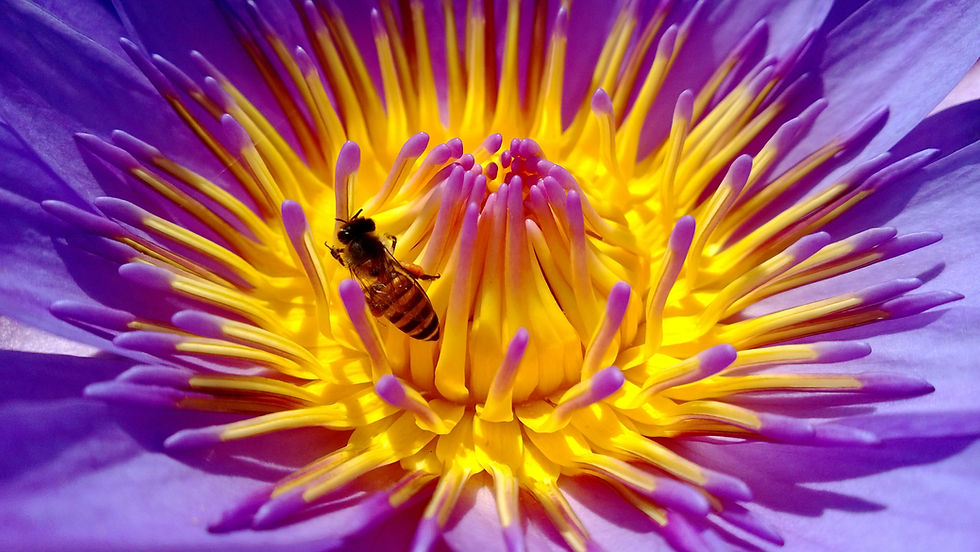
Photo on FreeImages.com
Color Temperature and White Balance
Color temperature refers to the warmth or coolness of the light in your photos. Understanding how to adjust white balance settings on your camera can help you achieve the desired color tones and mood in your images.
👉 Related: What Is White Balance in Photography?
The Role of Cultural Context in Color Perception
Colors are not universal in meaning. While some associations may feel intuitive, color perception is shaped by cultural, historical, and social context. The same color can carry very different meanings depending on where and how it is used.
Color Meanings by Cultural Context
Color | Western Meaning | Asian Meaning | Other Contexts |
Red | Love, passion, danger | Luck, prosperity, celebration | Warning, urgency |
Blue | Trust, calm, stability | Immortality, healing | Sadness, authority |
Green | Nature, growth, freshness | Health, harmony | Wealth, fertility |
Yellow | Happiness, energy | Royalty, honor (historically) | Caution, attention |
Purple | Luxury, creativity, spirituality | Wealth, nobility | Mystery, wisdom |
Orange | Enthusiasm, warmth | Spirituality (Buddhism, saffron robes) | Energy, affordability |
Pink | Romance, softness | Youth, femininity | Playfulness, care |
Black | Elegance, power, mourning | Strength, mystery | Death, formality |
White | Purity, weddings | Mourning, death | Simplicity, neutrality |
Why This Matters in Photography
If your audience is global, the same image can be interpreted differently depending on cultural context.
For example:
A white-toned wedding scene may feel natural in Western cultures but carry different connotations elsewhere
A red-dominant image may signal urgency in one region and celebration in another
When working with color in photography:
Consider your audience’s cultural background
Avoid assuming meanings are universal
Use color intentionally in storytelling and branding
Understanding cultural context helps you create images that are clearer, more relevant, and more effective across different audiences.
Practical Tips for Using Color in Photography
Experiment with different color combinations: Don’t be afraid to experiment with different color combinations to see how they affect the overall feel of your photos. Play around with contrasting colors to create bold images, or stick with analogous colors for a more subdued look.

Photo by topfer on FreeImages.com
Use color to draw attention: Use bold colors to draw attention to the main subject of your photograph. Colors like red and orange are great for making your subject stand out.
Balance strong colors with neutrals: Balance strong, vibrant colors with neutral tones like black, white, and gray to avoid overwhelming your viewers. Neutrals can help tone down the intensity and bring focus to the main elements of your composition.
Pay attention to background colors:
Be mindful of the colors in your background as they can either complement or distract from your main subject. Choose backgrounds that enhance your subject rather than compete with it.

Photo by teslacoils on FreeImages.com
The psychology of colors is a powerful tool for beginner photographers, offering a way to evoke emotions, set moods, and tell compelling stories through images. By understanding the meaning of colors in photography and their psychological impact, photographers can create more impactful and visually appealing photographs. Experimenting with different color combinations, paying attention to color harmonies, and always considering cultural context can enhance your photography skills.

